Snagged a Bon Appetit cookbook from Barnes & Noble—so excited it came with free subscription to the magazine—and explored a new dessert tonight. My sister-in-law and I decided we wanted something mildly involved and this was a perfect outlet. The biscuits are delicately laced with lemon juice, which is topped with chilled lemon curd (lemon juice, eggs, and sugar), and a warm blueberry topping. Good cookbook and great result. [The picture above is further evidence that one must have white plates, they do so much for presentation.]
Thursday, June 30, 2011
Tuesday, June 28, 2011
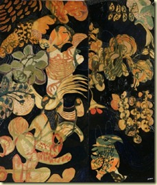
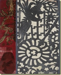
Wanted to make a bit of a shout for forEYESandHands’ Etsy Shop. Based in Denmark, the owner is art historian by degree and teacher (Danish and German) by trade. She uses her Etsy shop to sell all the pieces that can’t quite fit in her home, but which she can’t quite live without. Her “eye” for a good find is evident from the pieces below. Her profile expresses an enjoyment in owning something with a history and recirculating such history with each sale.
Monday, June 27, 2011
I came across a few cards at Anthropologie designed by Maira Kalman, and couldn’t help but enjoy their sardonic humor. Maira Kalman is a prolific writer (children’s and adult books), as well as a designer and illustrator. You have seen her work on the cover of The New Yorker. One of the cards I snagged is now hanging in my kitchen—a warning to my guests to cautiously request “deluxe.” And another bemuses [v.: to cause to have feelings of wry or tolerant amusement] from my kitchen counter as I cook! Her piece below, “Mad About the MET,” can be viewed from her site…worth a quick read. Her illustrations and language are engaging and humorous, lots of life described in just a few words. Check. Her. Out.
Tuesday, June 21, 2011
Friday, June 17, 2011
I was reading, in Lonny, about Fabricut’s recent line that was inspired by George Washington’s Mount Vernon. Apparently the designers at Fabricut spent hours on the grounds of Mount Vernon searching for inspiration. The collection took its cues from “…Martha Washington's dresses, the botanical gardens, decorative trim on a pair of Washington's pistol holsters and architectural elements from the Mansion.” The Mount Vernon Ladies Association permitted the company to indulge its curiosity; I can only imagine they were thrilled with the same. I can’t say I’m ready to reupholster my couch. But, I appreciate the endeavor to accurately incorporate history into fabric.
Thursday, June 16, 2011
It has taken me far too long to get organized, but, my pots (or at least the ones I will allow myself to purchase at the moment) are complete. Although I love the idea of tending to plants--piddling over them on the weekends and after work in the evenings--the aesthetic won out in my front yard. For the front, I chose plants with a decidedly art deco vibe, which happen to be quite self-sufficient. The staff at the nursery suggested the pebbles (A clever suggestion!). Very little piddling required. In the back, I’m entertained with geraniums, herbs, verbena, and coleus. Having just a few pots to tend to is likely more realistic given my day job!
Wednesday, June 15, 2011
I often meander through Kevin Sharkey‘s blog and articles in Martha Stewart Living. His flat in Manhattan is breathtaking, minimalistic and yet warm. He is constantly giving good advice about indoor plants or making fresh flowers fall within one’s budget. Today, I decided to review his recommended blogs and fell upon {this is glamorous} and Michelle Armas—the abstracts! I l.o.v.e. them: the color, vibrant, the composition, of interest. Here are some of my favorites.
Tuesday, June 7, 2011
I have been fully enveloped in work and other obligations lately, which leads me to neglecting my posts. I’ve found myself perfectly contented to read (dog-ear/annotate—I’m 100% nerd) the design magazines on the weekends. However, when faced with the option of donning sunscreen and reading the articles on the adirondack (by the lake) or sitting in front of the computer writing posts, I’ve consistently chosen the former.
But, I wanted to check-in anew, with a beautiful piece I saw, only in passing, at the MET this weekend. My girlfriend and I enjoyed NYC for 2 short days, wandering the streets, doing nothing in particular but enjoying the island. We were on our way to the roof-top bar at the MET (which must be experienced, if you have the chance), and passed the gallery which held the piece below. We should have stopped and taken in the piece, but, alas we did not.
Between Heaven and Earth was created to emulate the texture and depth of color of the textiles historically associated with the artist’s, El Anatsui’s, Ghana. I find it breath-taking.
The mixture of materials was reminiscent of the rug, from Matta, below. It is featured in House Beautiful this month (which is incredibly good). It is made out of recycled metal and thread. I wish it came in bigger sizes, I’d buy it for my bedroom. You’ll have to look at it in the magazine, because the picture below doesn’t do the metal “threads” justice. Love the pink.
El Anatsui. Between Heaven and Earth. 2006. The Metropolitan Museum of Art.


