Sunday, April 14, 2013

Moving!


Moving!

A little rebellion is a good thing.  

                                      -Thomas Jefferson

I have been reinvigorated to invest in this small endeavor.  So pleased for you to join me—update your bookmark, http://www.weekenddesign.me 

Manifestation No. 1 : http://www.weekenddesign.me 

Manifestation No. 2: Fresh Crop of Ideas

suitcases

Thursday, April 11, 2013

Impressionism, Fashion, and Modernity


Impressionism, Fashion, and Modernity

I am so sad to miss  this exhibition.  My Firm is shipping me off to NYC this summer for a week CLE (Continuing Legal Education) on drafting trusts.  Admittedly, I’m looking forward to the experience, not to speak of being in the City for a week—plus a post weekend stay for good measure.  All that to say, I won’t be shipped up until this exhibition is shipped out.  So let’s dig in and try to absorb from a distance.

Camille Monet,the painter's first wife (1847-1879). Canvas, 1866.

The exhibition Impressionism, Fashion, and Modernity  is an exploration of the interplay between modern culture, fashion, and the the painter during the 1860’s through the 1880’s.  The exhibition includes works by Renoir, Manet, Monet, Degas, Cassatt, and others—a collaboration of incredible pieces from permanent collections the world over.

impressionism_12

The narrative reminds the viewer that this period was when Haussmann was recreating the urban landscape of Paris—the oft admired rows of apartments.  These apartments stand today and beautifully line the city streets.  So interesting to understand the propriety and innovation of the period in which these paintings were created.

IMG_0468

The exhibition speaks of the shift in the focus of the portraits in this period—an acute awareness of the hem to a more attuned attention to light and shadows.  It addresses the drama displayed by those clad in white and those in black.  And, also the simplicity of the man’s dress of the day—love these paintings.  Read more about the exhibition—not too long and quite insightful.

impressionism_22impressionism_19impressionism_17RMN1238impressionism_21

Claude Monet (French, 1840–1926). Camille, 1866. Oil on canvas; 90 15/16 x 59 1/2 in. (231 x 151 cm). Kunsthalle Bremen, Der Kunstverein in Bremen; Édouard Manet (French, 1832–1883). Lady with Fans (Portrait of Nina de Callias), 1873. Oil on canvas; 44 1/2 x 65 9/16 in. (113 x 166.5 cm) Musée d'Orsay, Paris, Bequest of M. and Mme Ernest Rouart; Mary Cassatt (American, 1844–1926) In the Loge, 1878. Oil on canvas; 32 x 26 in. (81.3 x 66 cm). Museum of Fine Arts, Boston, The Hayden Collection, Charles Henry Hayden Fund;  Edgar Degas (French, 1834–1917). Portraits at the Stock Exchange, 1878–79. Oil on canvas; 39 3/8 x 32 1/4 in. (100 x 82 cm). Musée d'Orsay, Paris, Bequest subject to usufruct of Ernest May, 1923; Edgar Degas (French, 1834–1917). The Millinery Shop, ca. 1882–86. Oil on canvas; 39 3/8 x 43 5/8 in. (100 x 110.7 cm). The Art Institute of Chicago, Mr. and Mrs. Lewis Larned Coburn Memorial Collection; Gustave Caillebotte (French, 1848–1894). At the Café, 1880. Oil on canvas; 60 1/4 x 44 15/16 in. (153 x 114 cm). Musée d'Orsay, Paris, On deposit at the Musée des Beaux-Arts de Rouen

Tuesday, April 9, 2013

Change


Change

20130408_171112 (1)

If you don’t like change, you're going to like irrelevance even less.

There are few things in life more constant than change and transition. I often rearrange my home.  To (1) choose the change and (2) render it instantly, is deeply satisfying.

I had a temporary roommate in my space, which was delightful and frightfully short-lived.  Her moving out spurned the inspiration to swap what was my office for my bedroom and vice versa.  I’m very pleased.  My bedroom is peaceful and soothing—that stage where it remains uncluttered and fresh.  It’s the first bedroom arrangement here that, despite the twin bed, doesn’t remind me of a dorm room.

Thursday, April 4, 2013

Demilune


The Demilune

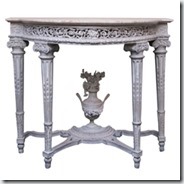
Thought we would tighten our vernacular by addressing the ever-helpful demilune [dem-ē-ˌlün] table.  A demilune is an occasional table which is always rounded and often includes a shelf or drawer—it can be crafted in most any style or aesthetic.  As you might suspect, the demilune takes its name by way of its shape—a half moon.   It incredibly versatile—lacking boxy corners—snugly fitting in tight quarters, such as hallways or foyers.  If one’s space permits, a pair of demilunes nicely flank a doorway and may also be paired to make a small table.  Always a smart purchase for most any space in your house.

T_WithoutZoomx_1

Demilune Wood Console – Mecox Gardens (Photo by Geoffrey Sokol). Abeille Demilune – Ballard Designs. Belle Epoch Console Table – Spurgeon-Lewis Antiques – 1st Dibs.

Tuesday, April 2, 2013

David Hicks


David Hicks

An article I recently read in Veranda referenced David Hicks during a discussion of trellis patterns.  Hicks was of relevance for his utilization of pattern, many of them deeply traditional (like the trellis), coupled with modern whimsy and bright colors.  Hick’s work seems as big as was his personality—married to an aristocrat and apparently steeped in his opinion of himself.  Hicks passed away in 1968, but his work endures and inspires many, including the avid Jonathan Adler.  I was entertained by a description of Hick’s disdain for chintz by Minn Hogg in an article in the New York Times: “…He killed every flower in his soul… . His was a rigorous, very tailored look.  So much of it was about control.  There wasn’t a wrinkle or crease anywhere.”  His work clearly defined much of what is mid century modern.  He is credited for successfully marrying modern with traditional--geometrics with antiques.  A simple trademark of David Hicks: patterned carpet.  His daughter, Ashley Hicks continues her father’s legacy with fabrics and interiors reminiscent of her father’s flair.

HIS WORDS

It is perhaps I who have made tablescapes - objects arranged as landscapes on a horizontal surface - into an art form; indeed, I invented the word . . . What is important is not how valuable or inexpensive your objects are, but the care and feeling with which you arrange them. I once bought six inexpensive tin mugs in Ireland and arranged them on a chimneypiece to create an interesting effect in a room which otherwise lacked objects. They stood there in simple perfection.

I dislike brightly coloured front doors - they are more stylish painted white, black or other dark colours. I hate wrought iron. I loathe colour used on modern buildings - it should be inside. I do not like conventional standard lamps - I prefer functional floor-standing reading lights. Function is just as important as aesthetics . . . Function dictates design.

Good taste is something which you can acquire: you can teach it to yourself, but you must be deeply interested. It is in no way dependent upon money.

The best rooms have something to say about the people who live in them.

An enormous number of ideas come to me whilst I am lying in the bath in the morning or the evening, so I always have something readily at hand with which to write.

HIS WORK

geom-wp_p163DavidHicks_p294_Tophicks-zebra2006-12-10-davidhicks1

Owens, Mitchell. “David Hicks, 69, Interior Design Star of the 60’s, Is Dead.” New York Times. 2 April 1998. David Hicks, Living with Design. Weidenfeld & Nicolson 1979. Photos: David Hicks (photo by Norman McGrath); David Hicks (David Hicks Archive); David Hicks  (David Hicks Archive) David Hicks  (David Hicks Archive).