This weekend, with a quick trip to the fabric store, napkins were a few shorts hours away. I aim to learn how to sew through simple repetition—small projects with little epiphanies, like mitered corners. Love IKAT. Love access to chic cloth napkins for a pretty finish to a weeknight dinner. Undoubtedly imperfect, yet a straight line to satisfaction.
Monday, January 30, 2012
Friday, January 27, 2012
Valentine’s Day
Have you heard the diatribe regarding the commerciality of Valentine’s Day? Do you buy into this? (No pun intended) Sure: Valentine’s Day is a home-run for the florist. Sure: You should and do love your Valentine the other 364 days of the year. Sure (and my personal favorite): This holiday often works out best for the ladies (those with a man, that is)(run from the man who ever says this!). But, despite the cynical ridiculing of the day, it remains one of my favorite holidays, if, for no other reason, the decorations! There is so much fun to be had.
Vintage blocks (MiaBooo Etsy Shop), a note (LemonDropPapers Etsy Shop) to send, ribbon (TheLonelyHeart Etsy Shop) to grace a “happy” for your Valentine, or a good wreath (WreathIncGifting Etsy Shop), all remind me of why I love the holiday. Its decorations are happy, whimsical, and lighthearted.
Now, you’ve seen my decorations before (last year), but, I wanted to show you a recent addition (see arrow below). This addition has easily become my favorite. Also, had to show you the spontaneous public art that pops up in downtown Orlando—a basket of flowers and hearts to accompany your gaze of Lake Davis.
Have a great weekend. Rest!
Wednesday, January 25, 2012
Potato [and Celery Root] Gratin with Leeks
Delicious. Well worth the wait. And, quite stunning on the table for my more than weekly dinner with my (irreplaceable) parents. Find it at Bon Appetit. [sans celery root, add onion!]
Monday, January 23, 2012
Charlotte Moss
So, if we are gonna talk trendsetters, we must be sure to discuss Charlotte Moss. A Manhattan resident, Moss has been part of the design world for decades. Her style is elegant, mostly formal, and lived in.
New York Social Diary (this site is the best for interviews of designers!) toured her Manhattan townhouse. The townhouse was indulgent and full. When inquired about the livability of a space (and to express disdain for minimalism): “I don’t understand it and I don’t mind saying it. I love beautiful objects. I think with some people it is a hoax because you can tell it is forced and it’s so contrived. Some people might look at this and say ‘well you’ve got too much stuff in here’, and I’ll go ‘well, it’s my stuff and ... it just sort of happened!’” Does this resonate with you? Oh, how it does for me. Most spaces start scant and then life happens and this card or that book, or this picture ends up throwing off and warming up what was symmetrically pleasing but utterly un-lived in.
Her blog(s), including A Flair for Living, are delightful. The stylized posts cover recipes and interior design. I adore the vintage pages of recipes--endearing excitement over croquettes. C’est Inspire (“What is Inspiring”) compiles photographs around a stated theme, with no words. So much to savor!
She packs a crew of 13 for any given decorating job and apparently has no more than 2 jobs going simultaneously. In addition to her work as a personal designer, she has published seven books and has a slue of licensing relationships: a fabric line with Fabricut, furniture line with Century Furniture, carpet line with Stark Carpet (these are incredible), and enamels for Halcyon Days (just to mention a few)
HER WORDS
On finding inspiration for design: “You must learn how to restore yourself and your creativity by stepping away from it. By doing something completely different. And to be really good, you have to get outside of this business altogether. Get outside of the business of design. Travel. Study. Garden. Meet new people. Embrace new ideas (emphasis added).”
On housekeeping: Moss was asked, “What is Ugly?” She replied: “Bad housekeeping. Clean! Givenchy said ‘Elegance is a bar of soap.’”
On being inspired: STORY BOARDS (a couple below from her most recent publication, Charlotte Moss Decorates)
HER WORK
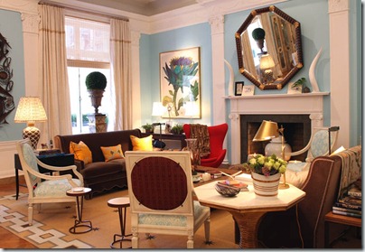
A Manhattan pied-a-terre for a cultured couple:
Her own Manhattan space:
Photos courtesy elledecor.com; newyorksocialdiary.com; and thestylesaloniste.com
Friday, January 20, 2012
Bunny Williams
Thought we should brush upon on a few of the designers actively molding the interior design world. A few big names come to mind, including, Bunny Williams.
Bunny Williams grew up in a warm, impactful family, who she can’t seem to escape an interview without mentioning. Southern, her designs are warm, inviting, with formalities that are livable. She worked as a designer at Parish Hadley [eventually, we will talk about Albert Hadley] for twenty years before beginning her own firm in 1988. Today, her business includes a furniture line (Beeline Home), an outdoor/garden furniture line (Treillage), active private decorating, books, etc. Her blog, Bunny’s Buzz, is updated often and a good one to note. After reading several of her interviews, her disposition is clear: honest, kind, opinionated, and balanced. Much of her work includes fine antiques, layers of differing woods, books, and fabrics. I identify with her practicality and adore her ability to create interest without sucking the oxygen out of a space.
HER THOUGHTS
In a interview with the blogger behind HamptonToes, Williams expressed her thoughts about children and furnishings: “I believe in living with good things and teaching children to respect them. Investing in quality pieces is always a good idea, they are made well and they last. However, nobody wants to stand behind a rope and look at a pretty room. A designers job is to help make smart choices when a house is being furnished.”
In a June interview with Curbed, she laid out a few foundational rules to decorate by:
I don’t totally live by the rules but I do believe decorating needs a good foundation, so I always keep these things in mind:
· Well-designed rooms need a focal point, a good floorplan, and furnishings with the proper scale to suit the space.
· A great paint color on the walls is the fastest and least expensive way to furnish a room.
· Arrange living room furniture so that at least eight people can have a conversation. In a large room, organize the furniture into smaller conversation groups so that either two people or 20 can feel comfortable in the space.
· Sofas and other major pieces of upholstery are best covered in simple fabrics in subtle colors that one can live with for a long time. Accessorize with colorful pillows that can be easily changed.
· Working on a budget inspires clever ideas—repurposing things like Indian bedspreads for curtains, stenciling a graphic design on a sisal rug, or using architectural elements as artwork.
· Every room needs a surprise—something that doesn’t match. It could be a pop of color, contemporary art, a painted finish, or a character chair.
HER WORK
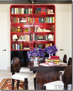
As featured in the February/March issue of Elle Décor, Williams experimented with an interior designed as “transitional,” she explains: “…which means that when someone walks in here in 25 years, they won’t be able to tell when it was done.”
I love this house from her portfolio [Look at those alstroemeria lilies—$4.00 at the grocery store!]:
And a couple more of my favorites:
Photos Courtesy www.BunnyWilliams.com
Wednesday, January 18, 2012
Pillows
Aren’t these pillows awesome? Tempted to snag one from One Kings Lane (third = favorite).
Monday, January 16, 2012
A (Propped) Proposition
I was reading an interview in House & Garden (a magazine I chose for a bit of a change) with designer Ann Boyd of Ann Boyd Design Ltd London, about her newly re-designed cottage. She was describing her affinity for propped pictures and mirrors. Known for a simple aesthetic, Boyd explained her love of the ‘propped’:
A peculiarity of the cottage is that many of the mirrors—and pictures—are propped against the wall rather than hung. Ann enjoys the sense of possibility this creates— “It looks as if you might move them, though you probably won’t”—and that it leaves the walls relatively empty. It is also, she adds, a good way of concealing unattractive pipes.
The use of propped pictures and mirrors can be employed in rustic, prim, and homey interiors, alike. I enjoyed the interiors below—the use of propping to convey a rest or calm, or a sense of intricacy and depth with the shelf and mantle. So interesting, any application in your house?
Mary McDonald (Design). Robert Trachtenberg (Photography).
Hattie Wolf & Abby Rizor (Design). Thibault Jeanson (Photography).
Ellen O’Neill (Designer).
Betty Lou Phillips (Designer).
Photos Courtesy of House Beautiful.
Friday, January 13, 2012
Fine Cell Work
I recently read about the charity Fine Cell Work, founded in England, which aims to train prison inmates in the art of embroidery. Envisioned by Lady Anne, Fine Cell Work was formed to provide the inmates purpose and an occupation during longs days within their prison cell. Lady Anne commissioned the British government to allow the prisoners to be compensated for their work. She succeeded and an incredible charity was born. The inmates are trained and receive 37% of the proceeds from the sale of their work. Those skilled in the art spend upwards to 40 hours stitching a week! Remarkably, 75% of the participants are male. 71,000 pounds were collected by FCW stitchers in 2010, alone. See their work below; so, fascinating:
Think a similar charity would be successful in the United States, where the cultural environment is so varied? Perhaps? Only time will tell…(there are evidently plans to try it out in the U.S., soon).


